Five free, unique font pairings for your online business.
As far as your brand’s visual identity goes, fonts have to be one of the most impactful design tools. But they’re often ignored by online business owners.
It’s easy to just use any old font and be done with it. Especially when the options at the top of the Google Fonts list are perfectly ok.
But when you decide to just use Raleway or Poppins and get on with things, two things can happen:
Your brand feels identical to everyone else’s. Brand recognition happens when someone has consistent, repeated interactions and experiences with your business. But that recognition can’t happen effectively when your audience could potentially mix up your branding with someone else on their feed. This constant misidentification can make the process of establishing a relationship with your audience way longer than necessary.
You lose an opportunity to connect deeply with your audience. Fonts are a super interesting visual element because they directly support all of your copy. A slick font won’t help you if your messaging isn’t great, and likewise, good messaging can work regardless of font. But a strategically placed font can help to strengthen the connection with your ideal customer or client by establishing a feeling or experience that your audience resonates with.
But I get it - I hear from almost every client I work with that fonts are tricky.
It’s hard to know which ones work, how many you should have, and what you should be looking for to suit the kind of business you have.
So to help you out, I’ve put together five simple pairings of free Google Fonts. I’ve made a note of what kind of experience each helps to establish, and what each font should be used for.
I’ve also provided links to download the file, so feel free to grab them and start using them for your online business!
Let’s get into the fonts.
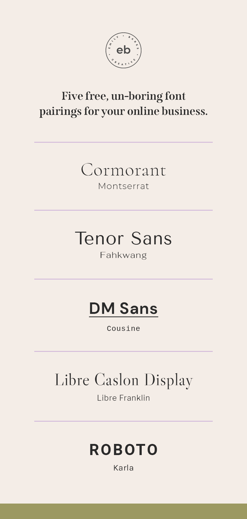
Cormorant & Montserrat
Get Cormorant | Get Montserrat
Cormorant is a classic, delicate sans serif. The design is based on one Garamond, one of the oldest + most recognizable fonts ever made, which gives Cormorant a stylish, traditional feel. It’s refined, elegant, and is awesome for major headings. I’ve paired it here with Montserrat, which is a really clean, modern sans serif. It’s great here for body copy + minor headings, and it brings enough of a contemporary influence to help balance this pairing, and keep it feeling current.
CLASSIC - ELEGANT - SOFT
Tenor Sans and Fahkwang
Tenor Sans is like a fun mid-way point between a traditional serif and a contemporary sans serif. It works well for major headings in regular sentence case and also in all caps. Fahkwang is both a Thai and English language font, - hence the name that can sound a liiiiiiiiitle bit naughty if you say it out loud. But it’s a gorgeous sans serif for body copy and minor headings. The width of the letters really adds to the modern, high-end vibe of this pairing.
CONTEMPORARY - REFINED - EXCLUSIVE
DM Sans + Cousine
DM Sans is a lovely, rounded sans. It’s clean, bold, and really makes a statement when used for major headings with bright colors or text accents like underlines. Cousine is inspired by Courier New, a font originally developed from IBM typewriters and then digitized for early computers. Pairing the vintage feel of Cousine with the contemporary lines of DM Sans establishes a quirky, modern vibe.
MODERN - BOLD - PLAYFUL
Libre Caslon Display + Libre Franklin
Get Libre Caslon Display | Get Libre Franklin
This pairing is inspired by editorial / fashion magazines. Libre Caslon Display is a stylish serif font, and the weight and contrast of the letters have a classic, high-end feel. In this pairing, Libre Caslon Display is great for major headings, and can even be italicized for accents like pull quotes. I’ve paired it with a simple sans serif in Libre Franklin for body copy and minor headings, which allows Caslon to stand out while still being easily legible.
EDITORIAL - HIGH END - FASHION-INSPIRED
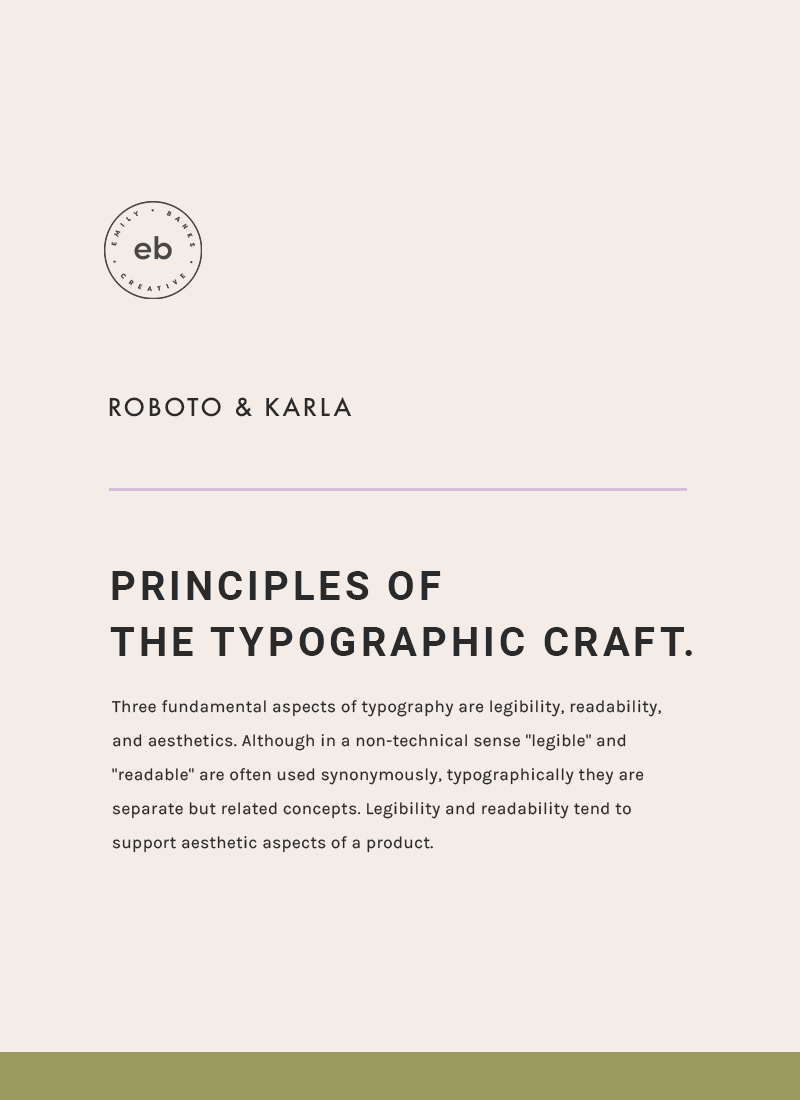
Roboto + Karla
If you love the look of fonts like Raleway or Poppins and want to achieve something similarly clean + bold without using the same font as everyone else, you’ll love this pairing. Roboto is a simple, bold sans serif and works well capitalized for major headings. The slight rounding in Karla (body copy, minor headings) introduces contrast and a little softness into the pairing overall.
SIMPLE - CLEAN - NO FUSS
A good selection of fonts can really help to solidify and support your copy, message, and overall brand.
I hope you like one of these font pairings enough to use it for your own online business! If you’ve got any questions about fonts, design or branding in general, feel free to leave them in the comments below and I’ll do my best to answer you!
See you in the next one!
Emily Banks


